A Clever Drive Through Cairo’s Coolest Underground Parking Space
With pixel waves outside, neon inside and parking numbers coloured by Pantone, there’s nowhere you’ll lose your parking space.
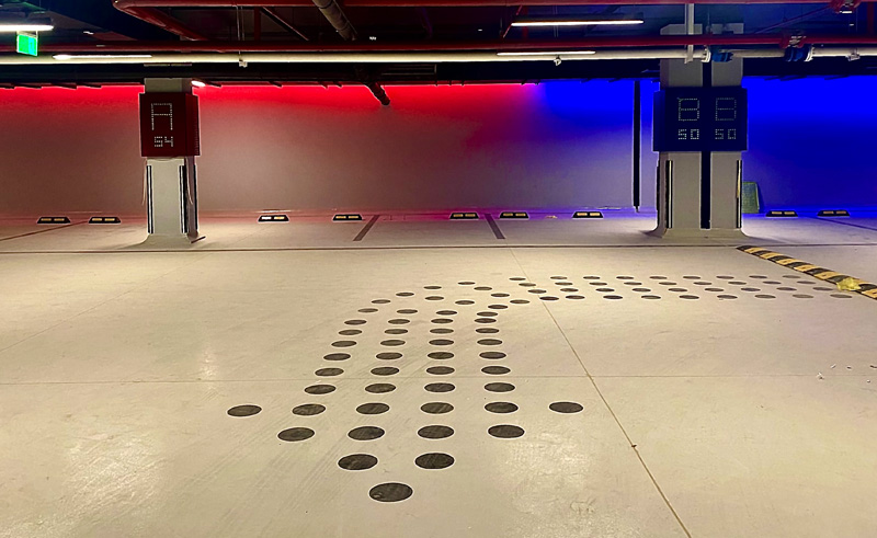
How often do you find yourself standing in a parking lot, wondering what happened to your once strong memory and where exactly your parking space was? Well, if you visit this brand new underground parking space in New Cairo, its engaging design will make it all the more difficult to ask, “Dude, where’s my car?”
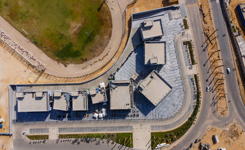
Created by Cairo-based design firm Studio Figurati, the parking spaces and hardscape design of the new rest-hub and comfort food destination Zia was informed by a belief that light should move spaces, colours can make us engage with public spaces and French architect Jean Prouve’s iconic designs never die.
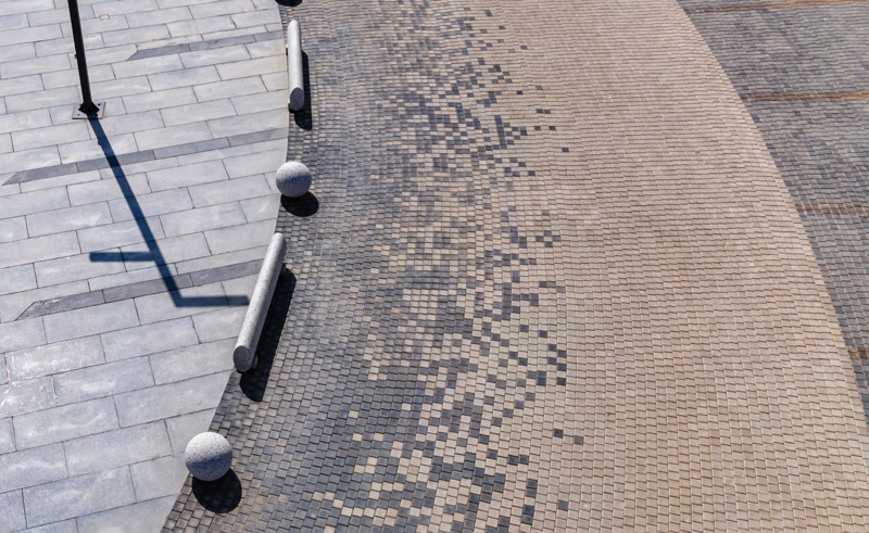 “The design team used different sorts of grids, starting with a pixel grid for the outdoors and ending with a modular grid in the basement floor,” Ahemd Wassef, Founder of Studio Figurati, tells #SceneHome. A transition between these hybrid systems is applied in the lobbies, where Prouve’s proportionally satisfying doors and partitions are found.
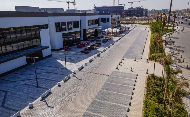
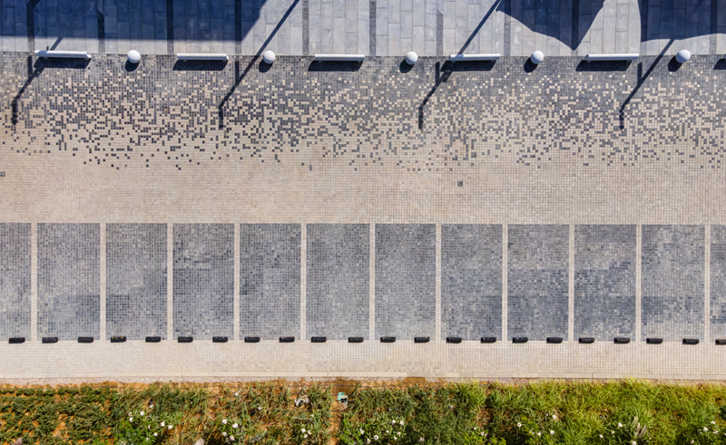
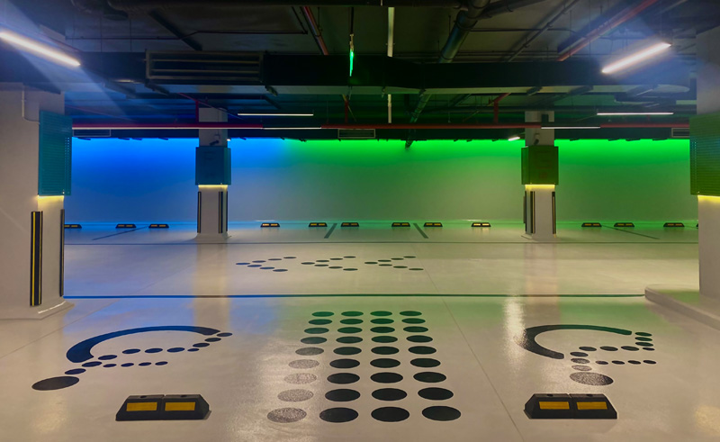 Driving into Zia, pixel flooring and sculptural bollards instantly establish that this is a public space that’s meant to look good - injecting aesthetics into an often-disregarded area. These aesthetics were derived from a parametric design that resembles day dissolving into night, or viewed from a different angle, darkness turning into light.
 “The concept combines aesthetics with value engineering,” Wassef explains. “Chiaroscuro, in art, is the strong contrast of light and dark, and the boldness of black and white. Locally sourced interlocking tiles creates this playful digital image.”
Branding mixed with architectural treatments resulted in a parking that is, quite frankly, unorthodox. Pixel shapes were used for wayfinding, cross-walks gradually changed with a gradient, and handicapped chair iconography features the same language used in numbering.
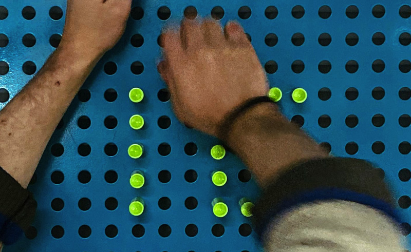
 The indoor parking is certainly not shy of colour. Studio Figurati introduced a research-based parking experience formed by blending RGB colour transitions and custom-designed modular numbering system that uses colour pins and perforated surfaces with colours by Pantone, making the parking spots visually memorable without the need to take a photo in order to recall it.
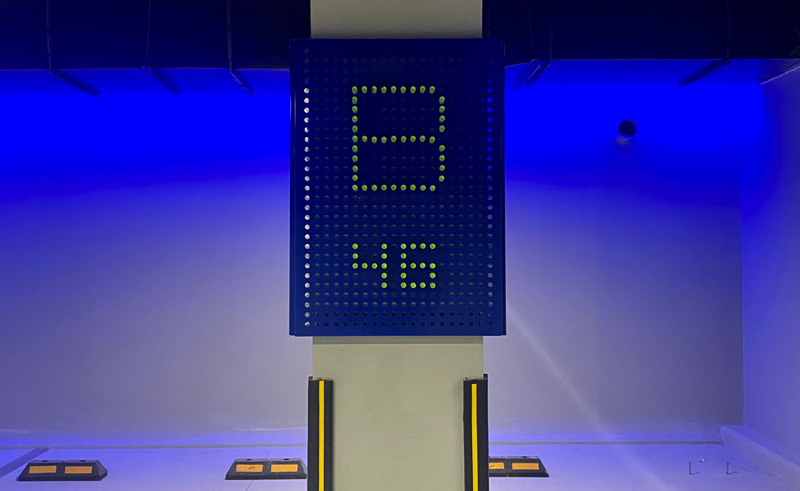 “Aesthetics were achieved while keeping the user experience smooth,” Wassef says. The space addresses multiple memory centres as the numbering system invites visitors to observe how the pins are clicked, crafting different shapes, numbers and letters.Coloured visuals increase willingness to read and explore, creating a unique parking experience formed by multihued combinations, light projects and precisely perforated surfaces by Pantone.
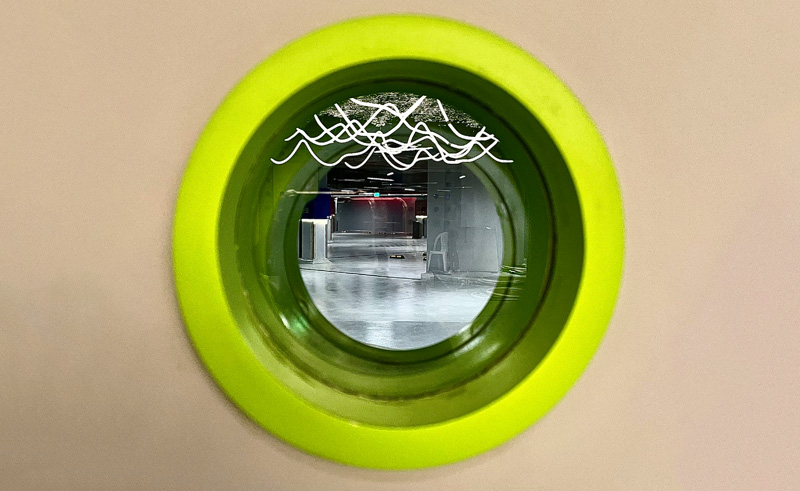 The design’s scope blended a variety of fields, from branding and landscape to hardscape and communication design, all coming together to add a flavour to the overall experience. “The team used raw materials to inform the iconography and initiate design thought by graphic designers who repurposed construction materials and marble waste to use as icons and signs,” Wassef explains.
 So far, reactions have been as you’d expect of a pixelated parking spot in New Cairo. “Art directors and artists have reached out to the venue, asking to film scenes and host fashion shows,” Wassef says. On that note, we don’t think it’ll be long before some form of creative content features the design as its backdrop; such is the purpose of public design.
Photography Credit: Studio Figurati


