How Mima A. Emad Used Colour to Bring the Most Out of Minimalism
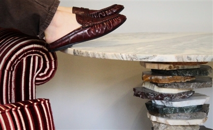
In this open plan residential unit visualised for a Spanish design studio, Mima A. Emad created minimal spaces with light tones that put a spotlight on statement pieces.
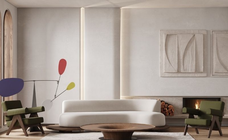
Minimalism has its many admirers. Maybe it’s the clear visuals, or the ease with which its aesthetics are absorbed. A brilliant way to showcase minimal designs is by emphasising textures, allowing for little distractions and highlighting the details and connections between the floors, walls, and ceiling. Which is what interior designer and CGI artist, Mirna A. Emad, exemplifies in this open plan residential unit called ‘Olive’, which was visualised for a Spanish design studio.
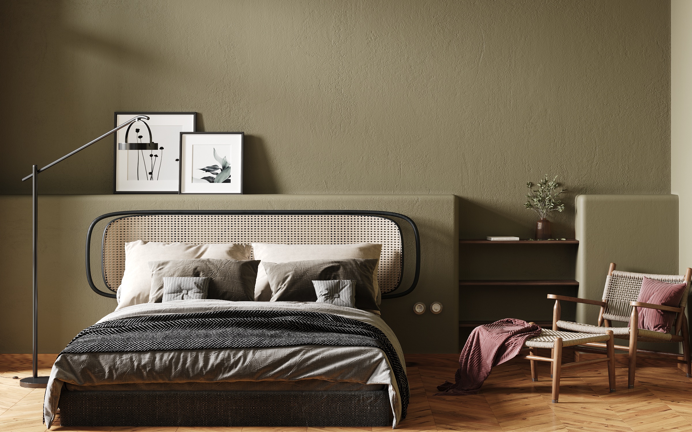 “The spaces are bright with light toned colours and feature statement pieces with a glimpse of olive green,” Emad tells #SceneHome. “When moving to the furnishing phase, the three key words were: scandinavian, sleek and organic.” Whether it's Brazilian furniture from Sollos, mid century architect Pierre Jeanneret’s chair or visual artist’s Alexander Calder’s artwork in the living area, this apartment demonstrates how minimalism facilitates, rather than eliminates.
- Previous Article HOW (NOT) TO GO TO A PING PONG SHOW
- Next Article UAE Experiential Learning Edtech Qureos Raises $3M Pre-Seed Round
Trending This Week
-
Mar 13, 2026
-
Mar 14, 2026


